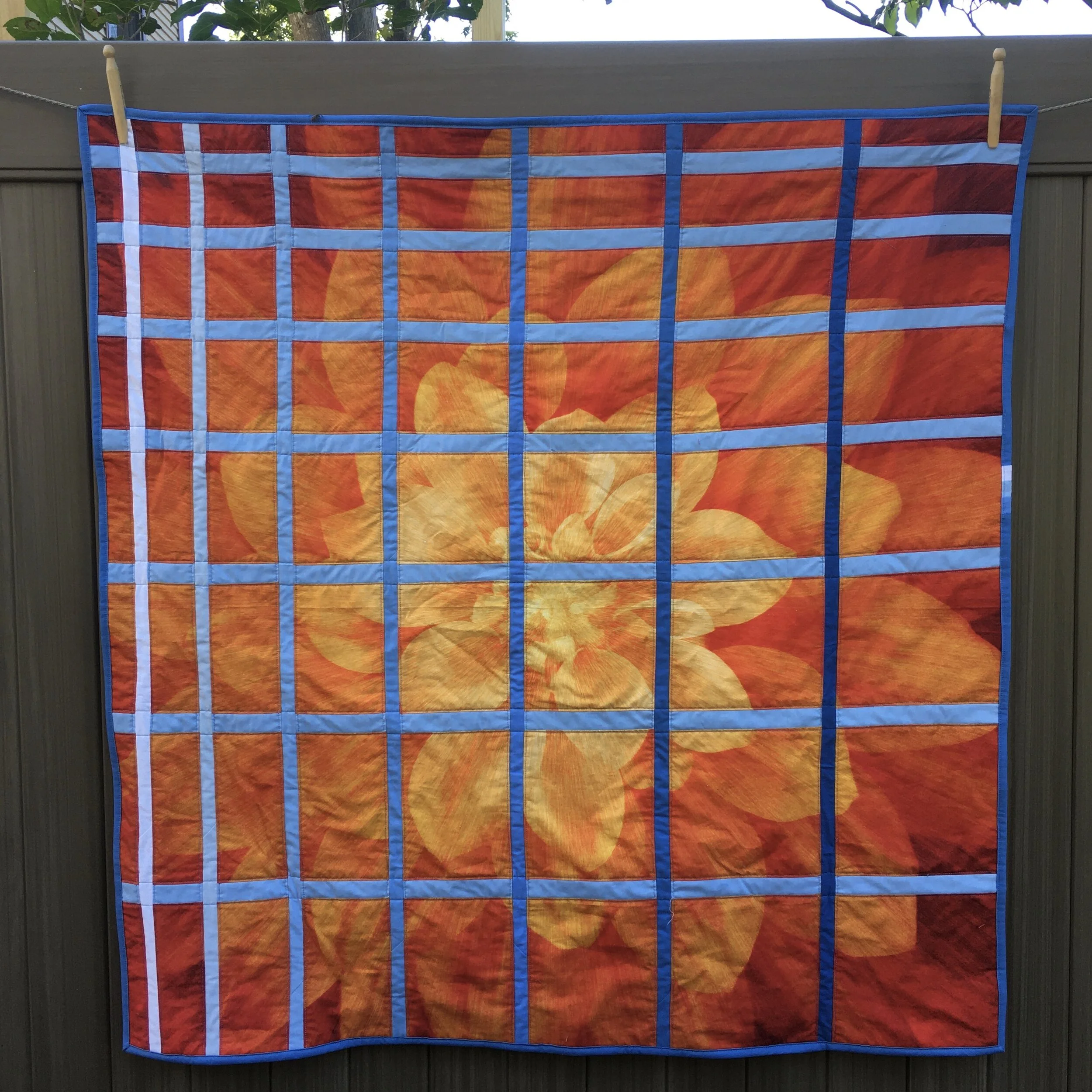
“Dream Big” Panel Color Study 43 x 45 inches
Back in 2014 I started writing some color study posts. (Look above at the top of the page for a gallery of some of studies). The first post color study featured complimentary colors in a quilt I called “Crosses and Losses”. Here is a picture of the finished “Crosses and Losses” quilt. Since they I’ve done a number of color study quilts.
This is my latest color study a quilt It’s also another of this year’s panel play quilts. This panel is a digital print by Hoffman called “Dream Big-Fire”
I like the way that complimentary colors (those directly opposite each other on the color wheel) can create a visual vibration. The “Crosses and Losses” quilt really vibrates! Almost too much. Yellow and blue are complimentary colors. The complimentary color for orange is teal. So blue isn’t the true compliment of the colors in this flower….it’s off by one position on the color wheel. But it does create a visual vibration.. So I’m happy with my choice.
Here is the original panel.
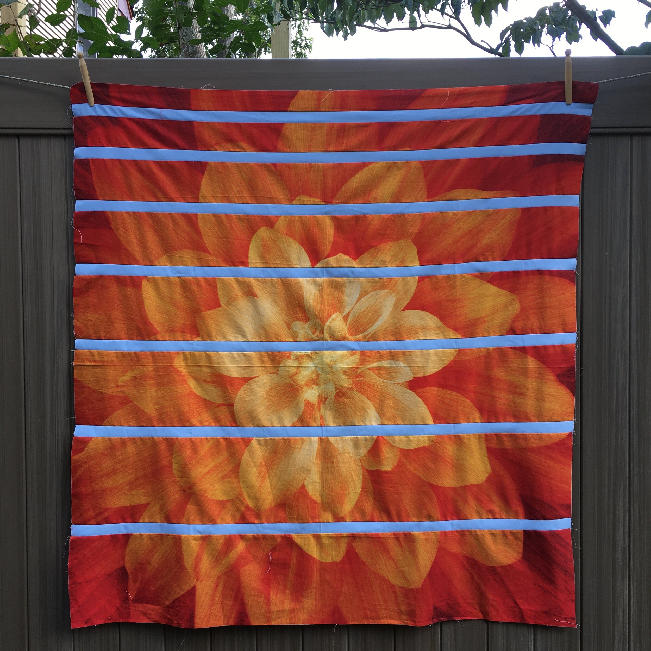
I cut the panel horizontally in 2, 3, 4, 5, 6, 7, 8 and almost 9 inch strips. I sewed the medium blue strips cut at 1 1/2 inches between each of the panel strips.
A quilt with just the horizontal strips would be a great place to stop. I really like it with just these blue strips.
But I carried on. I cut the panel again in strips using the same widths as above, only cutting this time across the new piece vertically. I had enough Kona© Cotton blues to create a gradient of blue strips, starting with white. These strips are slightly narrower, cut at 1 1/4 inches.
Here’s the back. The orange and blue theme continues! This Connecting Threads orange leaf fabric has been in my stash for years. I glad it’s finally found a perfect home!
Orange and blue! Another really bright quilt for 2020! It’s perfect for October! Maybe I should call it “Pumpkin Spice’! (Or maybe not)!!
(Note the run of gradient blues I put in on the binding)!


