As I mentioned in my post the other day, I finally understand what "hue" means after reading Kari Vojtechovsky's workshop "Principles of Color: a design workshop" in the new book, Essential Guide to Modern Quilt Making.
I've understood hue to mean a color. But what does that mean? I always used the word as "that's a nice hue" related to the gradation of a color. That's the first definition in the dictionary.
Kari defines hue in technical terms as "the location of a color in the color spectrum" of visible light. That's the second definition in the dictionary.
Brilliant. Green is the green in the rainbow. Red is the red in the rainbow. Violet is the violet in the rainbow. That is really clear. She goes on the say that even with all the possible variants of a color, the color's hue is always its pure form as seen in the light spectrum (rainbow).
Kari states she likes to use the light-based color wheel of cyan, yellow and magenta. But my stash worked out better using a color in the pigment-based color wheel (red, blue, yellow).
So, let's think about blue.
Of all the fabrics in my stash, I felt that this blue was the truest of the blues. So this blue is my Blue Hue.
Kari goes on to discuss how the saturation, the "degree of purity," of a color can be changed.
Add black to the hue and you get a "shade". Believe it or not, the color to the far right is the same blue fabric shown above. The middle and right fabrics are darker. It's clear in the fabric on the right that black was added to make that very dark blue, but harder to see in this photo with the middle fabric.
(All these photos were taken outdoors, a couple minutes apart).
Add white to the hue and you get a "tint".
Add grey to the hue and you get a "tone." That was a new concept for me. I always thought about adding either black or white to a color to get gradation. I never considered adding a mix of black and white…although I know I did it when I was a child and mixing paints. If black made my paint color too dark, I added white. It's the same idea.
The fabric colors in the photo below look much brighter than they really are. You can tell the far right color has grey added to the hue but it's not as apparent with the two middle colors. In actuality, all three of the colors to the right look greyish.
It's interesting that the Blue Hue fabric looks much darker and richer next to the fabrics where the hue has had grey added to it.
So, that's hue in a nutshell. If the color is found in a real rainbow, that's a hue, in this case, blue. If you add light or dark to a color, the hue is still blue but the saturation has been altered.
Kari has so much great information about color in her workshop. It's a lot of fun and really worth reading.
I've understood hue to mean a color. But what does that mean? I always used the word as "that's a nice hue" related to the gradation of a color. That's the first definition in the dictionary.
Kari defines hue in technical terms as "the location of a color in the color spectrum" of visible light. That's the second definition in the dictionary.
Brilliant. Green is the green in the rainbow. Red is the red in the rainbow. Violet is the violet in the rainbow. That is really clear. She goes on the say that even with all the possible variants of a color, the color's hue is always its pure form as seen in the light spectrum (rainbow).
Kari states she likes to use the light-based color wheel of cyan, yellow and magenta. But my stash worked out better using a color in the pigment-based color wheel (red, blue, yellow).
So, let's think about blue.
Of all the fabrics in my stash, I felt that this blue was the truest of the blues. So this blue is my Blue Hue.
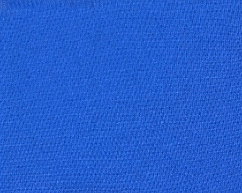 |
| Hue: Blue |
Kari goes on to discuss how the saturation, the "degree of purity," of a color can be changed.
Add black to the hue and you get a "shade". Believe it or not, the color to the far right is the same blue fabric shown above. The middle and right fabrics are darker. It's clear in the fabric on the right that black was added to make that very dark blue, but harder to see in this photo with the middle fabric.
(All these photos were taken outdoors, a couple minutes apart).
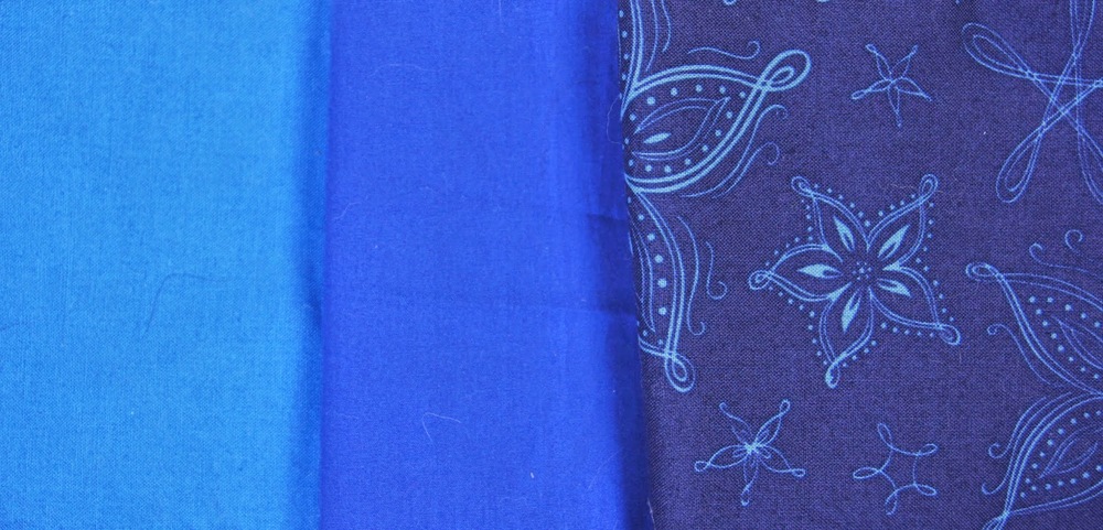 |
| The Hue Blue on the far left, with 2 shades of blue |
Add white to the hue and you get a "tint".
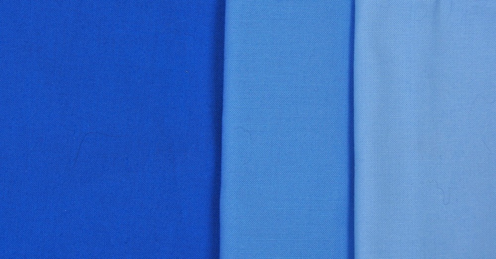 |
| The Hue Blue on the far left, with 2 tints of blue |
Add grey to the hue and you get a "tone." That was a new concept for me. I always thought about adding either black or white to a color to get gradation. I never considered adding a mix of black and white…although I know I did it when I was a child and mixing paints. If black made my paint color too dark, I added white. It's the same idea.
The fabric colors in the photo below look much brighter than they really are. You can tell the far right color has grey added to the hue but it's not as apparent with the two middle colors. In actuality, all three of the colors to the right look greyish.
It's interesting that the Blue Hue fabric looks much darker and richer next to the fabrics where the hue has had grey added to it.
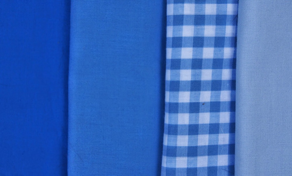 |
| The Hue Blue on the far left with 3 tones of blue |
So, that's hue in a nutshell. If the color is found in a real rainbow, that's a hue, in this case, blue. If you add light or dark to a color, the hue is still blue but the saturation has been altered.
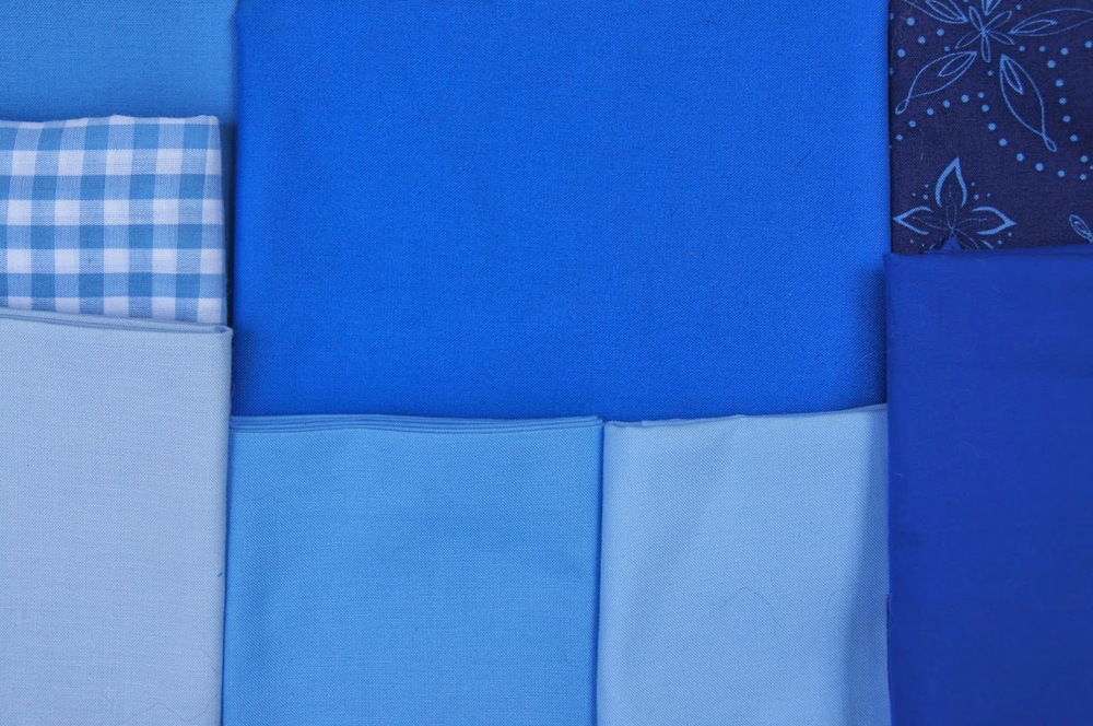 |
| The Hue Blue is upper middle, the two tints are lower middle. The greyed tones are the far left and the black shades are far right. |
Kari has so much great information about color in her workshop. It's a lot of fun and really worth reading.
